As we talked about in the last color theory blog post,
inspiration for color is all around us. In addition to seeing amazing combinations of
colors in nature, we can even look back through works of art to find patterns
of color combinations that have stayed true for hundreds of years. Continuing
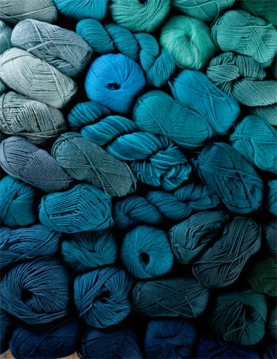
along with our theme of warming up the winter blues, we will take a closer look
at different shade of blue along with colors that are often paired with
blues – including paintings from centuries ago to present day fashion.
When I think of exceptionally lovely uses of the color blue,
I can’t help but think of the 17th century Dutch painter, Johannes Vermeer. Known
best for his domestic scenes of middle class life, Vermeer was also
particularly fond of bright, vibrant shades of blues which were often paired
with bold colors such as yellows, oranges, and reds.