As we talked about in the last color theory blog post,
inspiration for color is all around us. In addition to seeing amazing combinations of
colors in nature, we can even look back through works of art to find patterns
of color combinations that have stayed true for hundreds of years. Continuing
along with our theme of warming up the winter blues, we will take a closer look
at different shade of blue along with colors that are often paired with
blues – including paintings from centuries ago to present day fashion.
When I think of exceptionally lovely uses of the color blue,
I can’t help but think of the 17th century Dutch painter, Johannes Vermeer. Known
best for his domestic scenes of middle class life, Vermeer was also
particularly fond of bright, vibrant shades of blues which were often paired
with bold colors such as yellows, oranges, and reds.

Girl With a Pearl Earring (c. 1665)
One of his best known paintings, Girl With a Pearl Earring, is a beautiful example of a complementary color scheme. The blue and yellow clothing and head wrap seem to make each other brighter, even though they are both more muted shades than you would find on a simple color wheel. The ever-so-slight hint of red on the lips and in the cheeks adds a warmth to the overall painting as well as a subtle sense of contrast to the yellow.
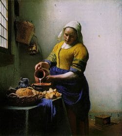
The Milkmaid (c. 1658)
In yet another Vermeer painting, The Milkmaid, also has similar shades of blues and yellows which are the focal point of the painting. The subtle orange and red tones of the table setting add the same warmth and sense of light as in his other paintings.
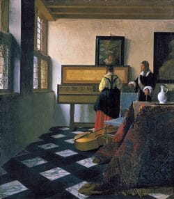
The Music Lesson (c. 1662-1665)
Vermeer’s The Music Lesson is another example of a triad color scheme in different proportions. The vibrant blues and yellows that are featured in the two paintings above are much more toned down, although still present. The warm light on the walls along with the red in the skirt and tapestry in the painting give the reds a slightly more dominant role in this particular image. By taking the bold use of yellow and blue down replacing them with soft yellow, orange, and dark navy shades makes the overall image feel well balanced.
And from a more modern day perspective – the color blue seems to be showing up everywhere! Outside of the fiber world, my love of color extend itself into the world of nail polish. So I was pleasantly surprised when I heard about several high-end companies devoting a collection of polishes to the wonderful shade of blue.
During the fall of 2011, Chanel released a series of nail polish to showcase the shades of blue which range from a vibrant sky blue to a medium denim, in addition to a darker Prussian blue.
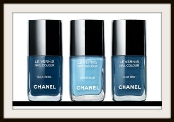
Les Jeans de Chanel
This trend continued right from the fall into winter as Dior also released their Blue Tie Collection, which included a duo of nail polish colors that focused on blues as well!
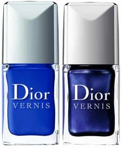
Dior’s Blue Tie Collection
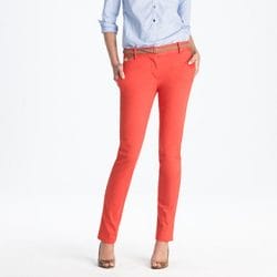
As for upcoming trends, it seems to be all about bright and bold colors – which is the perfect excuse to play with your color palette in order to find new ways of incorporating blues with other complementary colors. And remember, to be bright and bold you don’t necessarily have to use the most intense or vibrant colors for your project to stand out. Take a look at the fun, coral jeans in the image below – the orange has pink undertones and is soft while still being a color that stands out. When paired with a soft shade of blue, it complements the coral in a way that makes each brighter without being obnoxious.
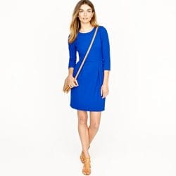
And remember when working with color, especially knitwear, that it is all about proportions. If you take two bright colors in equal amounts, chances are it will cause them to vibrate slightly – which is not a very flattering look. But take a peek at the dress below, it is a very bright cobalt blue and instead of pairing it with a bright yellow or orange, the camel colored accessories tone down the blue and balance it out. Since the beige (which can be seen as a variation of yellows and oranges) is a different value than the blue and is used as a small accent color, they can exist together in a balanced way without fighting over which color gets to be the dominant shade.
Normal
0
false
false
false
MicrosoftInternetExplorer4
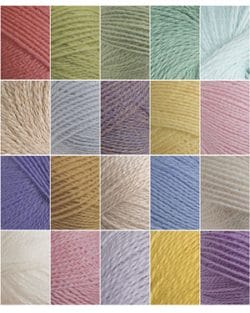
So go ahead, and don’t fear bright shades of blue! They can be lovely, vibrant and stunning when paired with complementary shades in appropriately proportioned amounts. I particularly am in love with our new Palette Spring Sampler for this very reason. You can play and experiment with softer shades of blues and pair them with fun, summery yellows, pinks, and corals for a look that is still vibrant without the use of harsher, primary shades.
Palette Spring Sampler
Whether you are looking back into the past through pieces of artwork or simply flipping through the latest fashion magazines to hit the shelves, you are bound to be inspired by new ways of using color. Once you start looking at the visual impact that different images have on you, take a closer look at what jumps out and seems to gravitate towards you. Chances are, you will find a pattern of colors that are just asking to be experimented with and turned into something different – like knitted and crocheted colorwork projects!
What are some of your favorite colors to pair with blue?


