A very common question I get is, “how do I pick colors for my colorwork project?” The short answer is that that’s a really personal decision. You know what colors you like or that you like to wear, and there’s no set aesthetic regarding what colors ‘should’ go together. (believe me, since art school, my personal color palette includes all of them!)
Generally, a safe bet for a 2-color sweater is to go with a light and dark version of the same color. So, that means a dark red and light red, dark blue and light blue, and so on. These colors can be interchangeable, so it can be a light or dark background. This is great if you have a favorite color in mind, or want to be completely sure that the colors will look good together. If you want to use two colors that you know go well together, be sure to use a light version of one and a dark version of the other.
That said, choosing a basic palette for a garment starts with a few basic steps. First of all, identify how many colors are in the pattern, and then identify whether there’s a main or dominant color. Since I’m mulling over colors for my own Aesa pullover, and it’s got such a simple color scheme, I’m going to use that as an example. There is a main color – in this case, a dark brown (the actual color doesn’t matter, so much as its dominance in the pattern). This color forms the ‘basic’ color of the sweater – from a distance, this is a brown sweater. While I love brown, I’m a huge fan of wearing bright colors. But let’s say I’ll be making a bright one, a purple-loving friend will make one too, someone whose uniform is black is making one, another friend who is obsessed with Victorian colors is making another… you get the picture. From a distance, we want a bright blue/soft purple/black/muted rose sweater. So, when choosing the MC, we’ll look at that color.
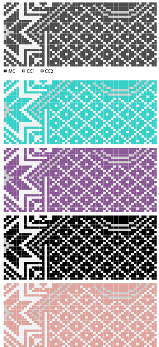
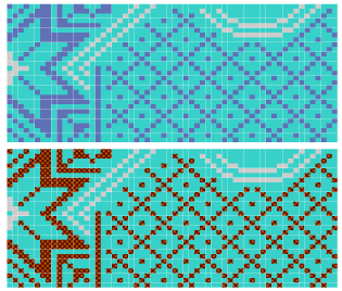
Next, we look at the next-most dominant color – in this case, CC1, or cream. This color (as well as the CC in most 2-color garments, including most Norwegian style ski sweaters) will tone the MC. This means that from a distance, it mixes with the MC to give a slightly different color. For Aesa, the cream CC1 lightens up the overall brown of the sweater, giving it a medium brown look. This color will also be more prevalent near the face, so if it’s of concern what will look good with your hair or skin tone, take that into account! The CC2 doesn’t have to be lighter – it can be a darker color, or something not in the same family. What matters is that the value is different enough from the MC to not make it disappear (value too close in similar color family) or ‘buzz’ – a value too close in a wildly different color family. You can see what happens if I pair a violet-blue of similar value with my bright blue – though having two balls of these colors next to each other makes them seem different, in practice one is lost. In the second example, I’ve chosen a color almost directly opposite the blue on a color wheel – orange – in the same value. Those colors are jarring to the eye, and unless that’s what you’re going for (hey, no judgement here!), then the best idea is to move up (lighter) or down (darker) in value.
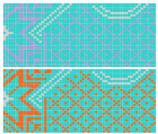
In the violet-blue example, I’ve kept the color family the same, but chose a darker value. In the orange example, I’ve also kept the same family but chosen a darker value. In both cases, the final result is much more pleasing to the eye.
For my bright Blue sweater, I want to darken it up a little – so I’ll choose a darker blue for my CC2. Let’s say my purple-loving friend is an LSU fan – her CC2 will be golden yellow. To keep it work appropriate, the dark-uniformed friend chooses a dark grey, and to complement the Victorian sensibilities of rose, this friend chooses a lovely mauve.
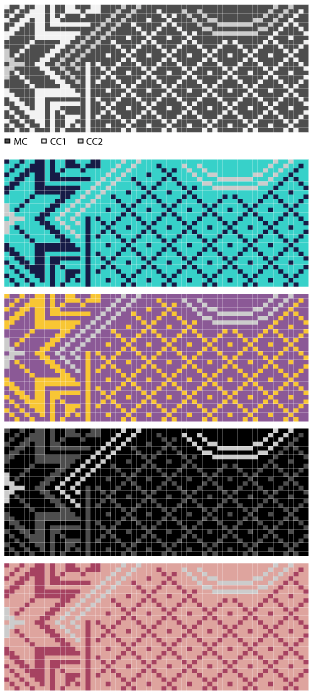
You can see how now my bright blue sweater is a less bright shade, because the navy blue has muted the tone. It’s taken the edge off that blinding cyan. From a distance, the purple sweater now looks more brownish, as the yellow mixes with the purple. The low-contrast colors of the black sweater make it only the slightest charcoal grey, which is appreciated by the wearer more than a viewer. The mauve mixes with the rose for an overall soft floral look.
The second contrast color is known as a ‘pop’ color. Many Fair Isle and other stranded designs have one – it’s often in the color family opposite the family of the main color on a color wheel. When you are using many colors, that’s a good place to start. This doesn’t have to be the case here, as you can choose a color you like for just that reason, or something you think goes particularly well with the other two colors. You’ll still want to keep the value in mind, since it’ll be touching the MC; so, not too close in value or in tone.
Not to be outdone by my LSU friend, I’m going with Orangemen orange to show off my Syracuse pride. Purple pal chooses a dark purple so as not to interrupt the school colors; uniformed friend goes with a nice sedate medium grey, and my last buddy goes with that Victorian staple pea green.
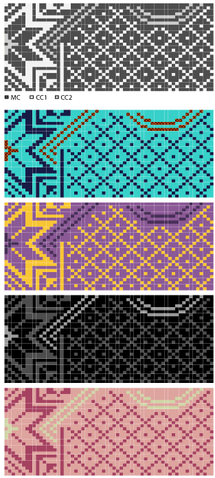
You can see how our personal choices have reflected both a sense of what we like and what we’d want to wear. Tweaking the colors like this on paper first give you a much better sense of how the colors will play together in the final piece. Sometimes, looks can really be decieving when you’re at the yarn store – seeing things in nice, neat skeins is very different to seeing them knit up. If you want good proof of that, look at the amazing 150 colors of Palette – all of them were chosen because of how they interact with other colors, so those really bizarre colors you see in there are absolutely amazing when in a colorwork project. The bright Orange, Macaw, and Cyan are perfect pop colors in sedate Fair Isle, the neither-here-nor-there Gosling, Bouquet Heather and Static Heather allow you to blend together colors you never imagined could.
If you really want to play, get the biggest set of crayons or markers you can find and some graph paper and start coloring. Once you’ve got a scheme you like, color each color separately onto a separate area of the paper, and compare that color to the yarn line of your choice to find the perfect match. Why separately? Well, looks can be decieving. Remember that Orangeman orange in my blue sweater? It’s actually a red-brown. The bright blue contrasts with the warm tones in the brown, making it look orange. If I just went with a bright orange, it would look too bright!
Now, just for kicks, here are a few more examples of what you can do just with this one pattern, the Aesa pullover, with a few minutes and some crayons. Go crazy!
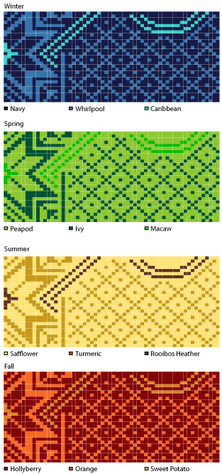
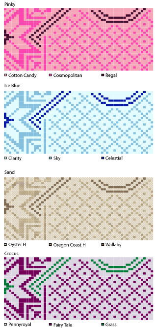
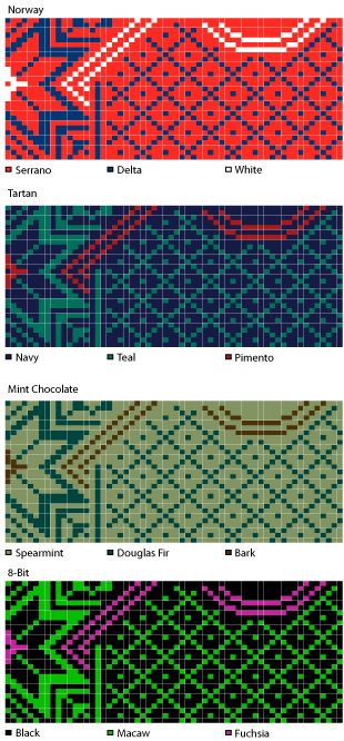
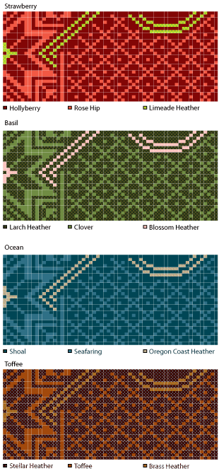
With so many colors of Palette to choose from, the possibilities are almost endless. If that’s overwhelming, you might want to check out our Palette samplers; these curated color collections all go together in pleasing combinations so you can try a set you like or just note which colors look good together without having to buy every color of Palette to see them all.
I’d love to see what you come up with. Have fun!


